Variable fonts
Variable fonts (OpenType Font Variations) let type designers combine multiple weights in a single font file. Variable fonts use OpenType’s variation mechanisms and give designers great flexibility, allow font data to be represented in an efficient format, and save weight on the web.
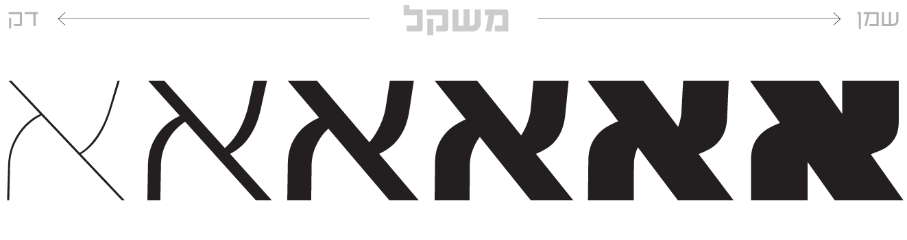
A variable font allows continuous variation along a given design axis, such as weight:
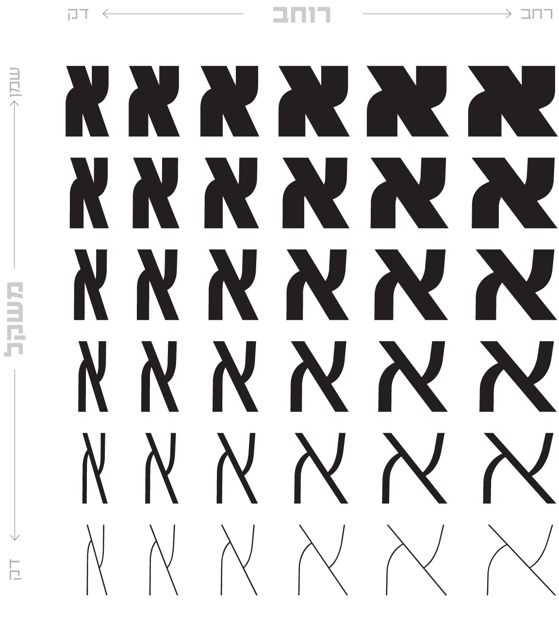
Variable fonts define one or more axes along which their design can change. Weight is one possible axis of variation, but other kinds are possible, such as a change in serif, a change in slant, and more. Variable fonts can combine two or more different axes of variation. The following example shows a combination of weight and width variation:
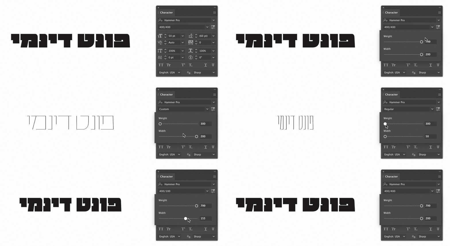
Today variable fonts are supported in all browsers and in Adobe’s Photoshop and Illustrator. The font is reached through a menu of sliders added to the text box. For example, the Hammer typeface in Illustrator has two axes, one for weight and one for width; sliding the sliders changes the shape of the letter.
The update to the OpenType format was presented in 2016 with the release of version 1.8, and a year later several variable fonts already appeared in the font folder of every Adobe cloud user. The most successful of them is Acumin, designed by Robert Slimbach: a geometric sans serif with three axes – weight, width and slant. The numbers represent the parameter, each of which has an upper and a lower limit. For example, the slant angle runs between 0 and 12 degrees, and weights run from 100 for thin to 900 for black.
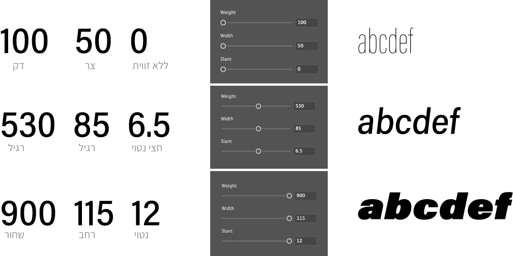
Acumin by Adobe
The arrival of variable fonts changes the way I approach the process of designing a letter. Because I define the “boundaries of the territory” of the type family for the designer, I allow myself to design the widest and the thinnest possible and to stretch the limits of the family, which makes for interesting research into the shape of the letter and hands control of it to the designer. They decide which width and weight serve them best. Choosing a style for your font becomes a game within predefined axes; design thinking turns from static to dynamic, and controlling the color of a block of text or the width of a column becomes simple.
In the Hafontia catalog we designed the Hammer family as a variable font, and celebrated all the weights, from thin to bold – from narrow to wide – in a video (turn your speakers on):